Index
Mobile Form
In Fluig, it is possible to handle workflow requests from mobile applications. Consequently, when saving a form in Fluig, a Mobile Form is automatically generated, according to the field mapping of the process forms.
In spite of the automatic generation feature of Fluig, there are several points of interest for the development and customization of Mobile Forms, which will be dealt with throughout this guide.
Recommendations for Processes with Mobile Forms
Responsive Form: On the market today there are varying sizes of screens and resolutions, so any form developed for Mobile should be responsive, i.e. it should fit any screen size.
Aesthetics: The visual appearance and HTML design must be attractive to users; we have achieved it through CSS or jQueryMobile, which will be explained in the next sections.
Usability: The form must be easy to use, containing only fields that are important for tasks or processes.
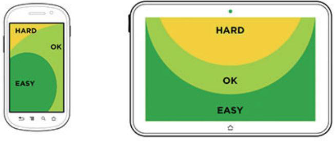
Click area: HTML elements must be well positioned in a manner that facilitates the click area because there are devices today whose screens are too small. Here is an example:

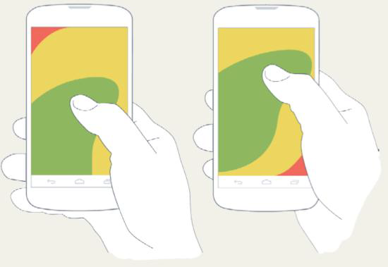
Positioning of the actions: The most important actions must be placed where the user can easily access them, as shown in the figure:
- Customizations: The customizations must be made within the process events or form definitions on the Web. All the events that are applied in web forms are also applied in Mobile Forms. For more information, visit the guide Customization of forms.
- Attached files: The attached files from the Web form are not loaded onto the Mobile form, so the CSS and Javascript functions should be implemented within the HTML Mobile.
- Access to internal and external services: Any access to Webservices or other external or internal services must be done via javascript. We recommend the use of jQuery Soap for Webservices.
- Not all information needs to be in the Mobile Form: The great restrain in Mobile is the screen size, so map the most important fields so that they are prioritized in the form. There are informative fields that don't have great utility for the process or tasks; they don't need to be included in Mobile Form.
- Types: The Mobile Form definitions support types:
- text
- textArea
- radio
- select
- combobox
- checkbox.
Benefits
Why should I use Mobile Form?
- It allows you to start/handle requests from any mobile device regardless of their geographic location.
- Quick access to the information, showing only the most relevant information.
- It allows the continuation of the process, even outside the corporate environment.
- Through the feature "Off-line process" I can fill in information even without access to the internet, for future synchronization.
Creating a Mobile Form
In Fluig you can create form definitions in different ways, using Fluig Studio, through the modeling of the workflow processes or through upload form in document navigation.
Now browse the tabs below and follow the ways to create forms:
Fluig Studio
To add a new form with support for mobile devices, execute the standard procedure for export of form and select the fields that will compose the Mobile Form on the screen before the conclusion of the export.
After the export, another HTML file marked as "mobile" in the folder forms of theFluig project will be included.
See in the following image the mobile selection screen when exporting a form:

Figure 15 - Mobile Form.
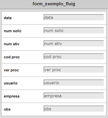
After the export, the form must be as the following image:
Note
After Fluig has identified the Mobile Form by name, it must have the same name as the web form plus the word "_ ecmMobile".
Example: After the web form "compras.html" has been created, the Mobile Form necessarily must be named: "compras_ecmmobile.html".
Setting Mobile Form in Processes
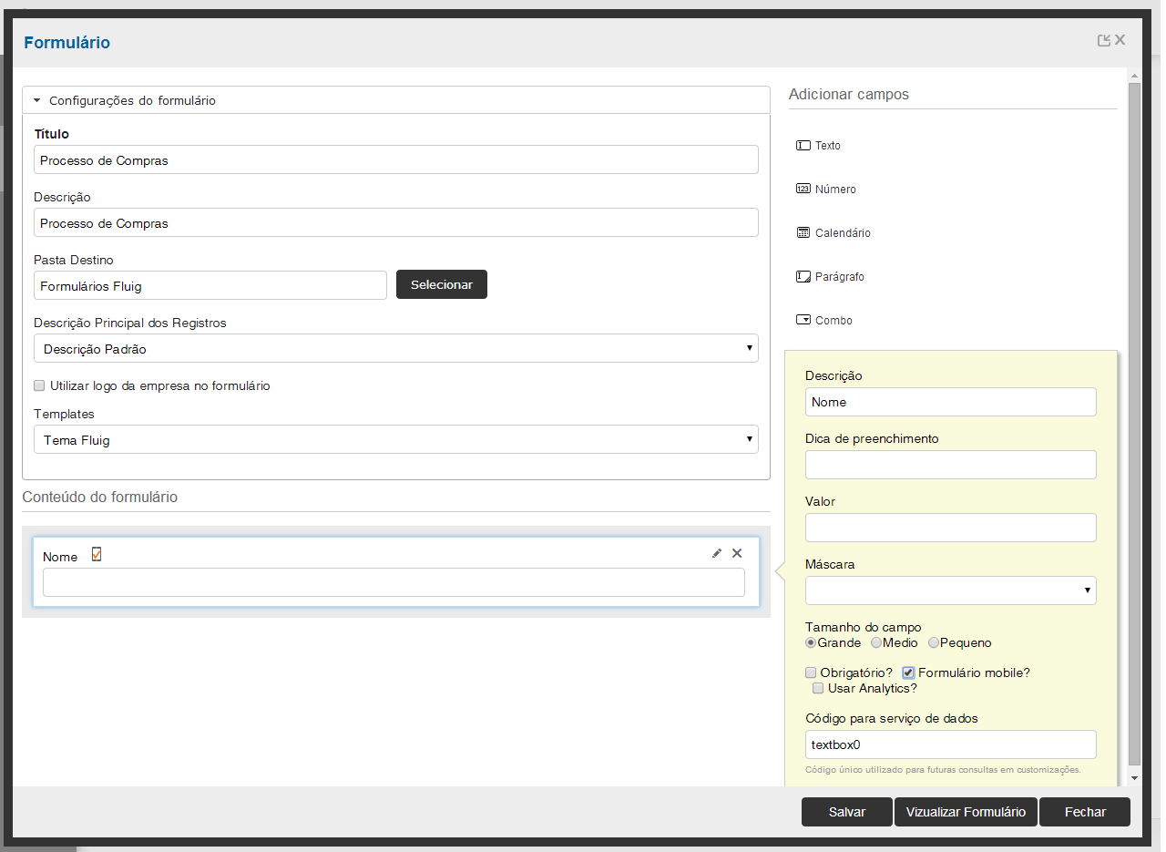
You can enable the creation of Mobile Form through the Form Generator, as in the step below:
Step 1: Create or edit an existing process and click the item Form.

Step 2: Select the target folder where the form will be published, also assign a title and description. After that, click Create form.

Step 3: Include fields and in each of them, select whether this will also be added to the form for mobile devices by clicking on the option Mobile Form?.
Upload via Document browsing
In the upload via document browsing a standard post of form is executed where the web form must have a defined name and the term _ecmmobile must be added to the Mobile Form.
.

Note
After Fluig has identified the Mobile Form by name, the Mobile Form must have the same name as the web form plus the word "_ecmMobile".
Example: After the web form "compras.html" has been created, the Mobile Form necessarily must be named: "compras_ecmmobile.html".
Attention
Form definitions generated by the methods of creation listed above need to be edited; in case there is need for any special customization, they are automatically generated containing the basic items for its functioning.
Customizing the Mobile Form
With the inclusion of forms that support visualization on mobile devices, it is possible to handle workflow requests and fill in the form information with greater mobility and agility.
As we have seen, the Mobile Form does not load file attachments so all the customization must be done within the HTML, which has a number of peculiarities that will be addressed below:
CSS
To customize a Mobile Form, the CSS used for the Web part probably does not apply to mobile device file, so it is recommended that the Mobile Form uses its own CSS to keep the form responsive.
The CSS should be inserted inside the head in the file .html Mobile with the tag:
<style type="text/css"> Insira aqui o CSS </style>.
Now browse the tabs below and follow some examples of CSS components that can be applied in Mobile Forms:
Body
body {
font-family: Verdana, Geneva, Tahoma, sans-serif;
background-color: #D1D3D4; /* Background color */
color: #58595B; /* Foreground color used for text */
font-family: Helvetica;
font-size: 14px;
margin: 0; /* Amount of negative space around the outside of the body */
padding: 0; /* Amount of negative space around the inside of the body */
min-width:300px;
}
Headings
h1 {
margin: 0;
padding: 0;
background-color: #D1D3D4;
color: #FFF;
display: block;
font-size: 18px;
font-weight: bold;
padding: 10px 0;
text-align: center;
text-decoration: none;
}
List
ul {
list-style: none;
margin: 10px;
padding: 0;
}
ul li {
background-color: #FFFFFF;
border: 1px solid #999999;
color: #58595B;
display: block;
font-size: 14px;
font-weight: bold;
margin-bottom: -1px;
padding: 12px 10px;
text-decoration: none;
}
ul li:first-child {
-webkit-border-top-left-radius: 8px;
-webkit-border-top-right-radius: 8px;

}
ul li:last-child {
-webkit-border-bottom-left-radius: 8px;
-webkit-border-bottom-right-radius: 8px;
 position:relative;
}
Label
.mylabel {
width: 28%;
 overflow: hidden;
text-overflow: ellipsis;
-o-text-overflow: ellipsis;
white-space: nowrap;
display:inline-block;
 position:relative;
 float:left;
 line-height:32px;
}
Input Text
input[type=text] {
width: 70%;
 font-family: Verdana, Geneva, Tahoma, sans-serif;
font-size: 14px;
background-color: #E8E8E8;
 position:relative;
 float:right;
}
TextArea
textarea {
width: 70%;
 font-family: Verdana, Geneva, Tahoma, sans-serif;
font-size: 14px;
background-color: #E8E8E8;
 position:relative;
 float:right;
}
Select
select {
width: 70%;
 font-family: Verdana, Geneva, Tahoma, sans-serif;
font-size: 14px;
background-color: #E8E8E8;
 position:relative;
 float:right;
}
You must handle in the CSS all the components that will be used in your HTML Mobile so all of them follow the same standard, your HTML Mobile with CSS should have this structure:
< html >
<head>
<title> Purchase Form </title>
< style type = "text/css" >
 <!--here you must add the CSS structure of each component-->
</style>
</head>
<body>
</ body >
</html>
Attention
This is the basic structure, which, within each tag, must have corresponding elements and logic.
jQuery Mobile
jQuery Mobile is a framework for interface of mobile devices that aims to give a responsive layout to form definitions. It greatly facilitates the development, because you don't need to create a CSS for each element and it can be used in Fluig Mobile. It is possible to follow examples in the link: http://demos.jquerymobile.com/1.4.2/.
This can be embedded into Mobile HTML in a simple way:
<html >
<head>
<script type="text/javascript" src="http://code.jquery.com/jquery-1.5.2.min.js"></script>
</head>
<body>
</ body >
</html>
JavaScript
As well as the CSS, javascript must also be within the HTML Mobile, so all the logic that on the web is usually in .js files should be transferred to the Mobile Form.
To keep organization within the HTML, we recommend leaving the logics at the end of the file:
<html>
<head>
</head>
<body>
</body>
</html>
<script language="javascript">
 /* Here you should add logic javascript */
</script>
Attention
To test the Mobile Form, open the html Mobile file in a browser on the desktop. If there are no inconsistencies, the form will probably open correctly in Fluig Mobile as well.
Services
In order to use internal or external services to Fluig, it is necessary to instantiate, execute and handle the return of service via javascript. For webservices, we recommend the use of jQuery Soap.
Here are a few tips:
- The use of Fluig internal services, such as Dataset, should be made preferably in customizing events for Formand Processes, so what will be customized for the web will also be adopted for mobiles, avoiding code replication.
- Special techniques for web forms, such as the dataset calls within the form, are not applied to Mobile.
Translation of forms
The translation of Mobile Forms must be made by following the guide to Translation of Forms . However, the difference is that you will need to add three new files with the literals following the nomenclature below:
- Portuguese: name_of_mobile_form_pt_BR. properties;
- English: name_of_mobile_form_en_US. properties;
- Spanish: name_of_mobile_form_es. properties.
Example: If the form is called compras_ecmmobile, then the .properties file names will be:
- compras_ecmmobile_pt_BR.properties;
- purchases_ecmmobile_en_US.properties;
- compras_ecmmobile_es.properties.
Parent Child pages for mobile devices
The fields that employ the technique of parent and child pages are not inserted into the automatically generated form for mobile devices by Fluig. But the product allows you to develop a customized form for mobile devices by consulting these fields.
The editing of parent and child fields through mobile devices is not possible, even in customized forms. These fields are available only for consultation.
The query to the parent and child fields on mobile devices is performed by means of javaScript functions available within the masterList object when the form is displayed. They are:
getValue
Returns a string with the value of a parent and child field, receiving the sequence number of the child, and the name of the field as parameters.
masterList.getValue(sequence,field);
getValues
Returns an object with all the values of the parent and child fields, grouped by sequence number. This method has no parameters.
masterList.getValues();
getValuesBySequence
Returns an object with all the values of the fields of a given sequence. Receives the sequence number as parameter.
masterList.getValuesBySequence(sequence);
getValuesByField
Returns all the sequences and values of a given field. Receives the name of the field as parameter.
masterList.getValuesByField(field);
Insert request attachments directly from the form.
There is a very simple way to save attachments upload through a button on the form. To do this, it is necessary to insert in the event onclink of the button the method showCamera:
<input type="button" value="Insira Foto" onclick="showCamera(nome_do_anexo);"/>

<script language="javascript">

          function showCamera(parameter) {
              JSInterface.showCamera(parameter);
          }
</script>
The parameter name_of_attachment is a string and corresponds to the name of the attachment that will be saved in the list of attachments of that request.
How to identify that I'm using Mobile in the events?
With this feature, it is possible to apply a customization and/or restriction only in the Mobile Form, regardless of the Web. So, I can define that a process or activity will receive a distinguished value or that a particular activity cannot be performed by Mobile via customization.
There are two ways to do this customization:
Form events
All the events that receive the form in the method can have a unique customization for the Mobile Form, namely:- AfterProcessing
- AfterSaveNew
- BeforeProcessing
- DisplayFields
- EnableFields
- InputFields
- ValidateForm
To use the event, it is necessary to make the following call form.getMobile(), which returns a Boolean indicating whether it is a Mobile Form or not. Example:
function displayFields(form, customHTML) {
   if ( form.getMobile() != null && form.getMobile()) {
     form.setValue('mtr_usuario', new java.lang.Integer(123456));
   }
}
Process events
In the process events, the property WKMobile identifies if the action was performed by the mobile device, it can be used in the process events as in the example:function beforeStateEntry(sequenceId){ var isMobile = getValue("WKMobile"); if (isMobile!=null && isMobile==true){ throw "this process cannot be executed by mobile."; } }
Example
Please download the example files here.
Below is an example of a form that has been mapped for use on mobile devices:
- Web Form

- Mobile Form

Note
As we can see, the Web Form has many fields and its mapping for mobile devices must be done very carefully.
The fields Proposal Data were mapped for Mobile, note that there are fields that do not exist in the Mobile as they are not necessary in this context:

Items that are in a table can be transformed into a collapsible of jQueryMobile.
By clicking the button '+', the item is expanded:

Visão Geral
Import HTML Content
Conteúdo das Ferramentas
Tarefas