Objective
The objective of this guide is to enable developers to create WCM components via Fluig Studio.
Building WCM components in Fluig Studio
Initially, go to Fluig Studio and create or open a Fluig project.
Open the Fluig perspective through the menu Window/Open Perspective/Other.../Fluig (Figure 1).
 Figure
1 - Fluig Perspective
Figure
1 - Fluig Perspective
Widget Creation
Follow these steps:
- In Package Explorer, click on the right button and choose New...
Select the Widget option.
Fill out the required fields of the Widget component (Figure 2): Code (key field), Name and Description.

Figure 2 - Creating a new Widget (required fields)

Note
The Code field is unique (key field) and must be filled out with letters, numbers and underscore.
- Choose a Template for your widget from the combo-box button, or check None if you do not wish to use a template.
- Click Next to continue (Figure 3) filling out the fields or Finish to conclude.

Figure 3 - Creating a new Widget (optional fields)
|
Note The Code fields of developer, Name of developer, URL of developer and Category are optional. As for the Renderer field, it allows only one option: Freemarker. |
When concluding the Widget construction, the directory structure should be as shown in Figure 4 below.

Figure 4 - Structure of directories of a Widget project
Where:
File/Folder |
Description |
|---|---|
<código-da-widget> |
Name/Identifier of Widget. |
src/main/java |
Location of Java classes, in case of any specific business rule of the Widget. |
src/main/resources/application.info |
Configuration file of the Widget, where the Widget code, title and developer is persisted, among other information. We will provide further details on this file in the following pages of this document. |
src/main/resources/view.ftl |
Freemarker template file that will be interpreted during rendering of the Widget. |
src/main/resources/edit.ftl |
File that will be interpreted during rendering of the Widget in edit mode. Used to configure specific options for rendering of the Widget, such as, data filters, the dollar exchange rate, etc. This file is optional, and if it is not available, it will be considered that the Widget has no edit mode, being view only. |
src/main/resources/<código-da-widget>.properties |
Translatable string file used by the Widget. Must have derivations according to the language supported by the Widget. The default will always be the Widget code followed by the suffix referring to its language. A file being translated to English would be: “código-da-widget_EN_US.properties”. |
src/main/webapp/icon.png |
Icon that represents the Widget. It will be used to represent the widget on the side menu of the application, or on any screen that requires a visual representation of the component. Dimension must be 55 x 30. |
src/main/webapp/WEB-INF/web.xml |
Default descriptor of a Java application for the web. |
src/main/webapp/WEB-INF/jboss-web.xml |
Specific director for JBoss. Must contain at least the property “context-root”. The context-root represents the Web context of the Widget and we recommend using the same code as the Widget. |
src/main/webapp/resources/css/<código-da-widget>.css |
Not in Widget style. |
src/main/webapp/resources/js/<código-da-widget>.js |
Javascript file of the Widget (if needed). |
src/main/webapp/resources/images |
Specific image folder of Widget, if needed. |
src/test/java |
Specific folder for building unit tests. |
Example of JavaScript code
var applicationCodeObj = SuperWidget.extend({
    instanceId: null,
    sociableId: null,

    init: function() {
        //code
    },

    bindings: {
        local: {
            'someFunc': ['click_someFunc']
        }
    },
    someFunc: function() {
    }
});
Example of HTML code with FreeMarker (view.ftl)
<#-- cria uma div para a widget -->
<div class="wcm-widget-class super-widget"
    <#-- pega o id do objeto applicationCodeObj -->
    id="applicationCodeObj_${instanceId}"
    <#-- parâmetros de dados para a lista -->
    data-params="applicationCodeObj.instance({param1: 'teste', param2: 'ok'})">
    <#-- cria a internacionalização da widget -->
    <h1>${i18n.getTranslation('hellow.example.hello')}</h1>
</div>
Layout Creation
Follow these steps:
- In Package Explorer, click on the right button and choose New...
Select the Layout option.

Figure 5 - Creating a new Layout (required fields)
Fill out the required fields of the Layout component (Figure 5): Code, Name and Description.
Choose a Template for your layout from the combo-box button, or check None if you do not wish to use a template.
Note
The Code field must be filled out with letters, numbers and underscore.
Click Next to continue (Figure 6) filling out the fields or Finish to conclude.
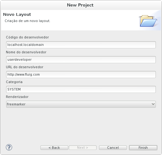
Figure 6 - Creating a new Layout (optional fields)
|
Note The fields: Code of developer, Name of developer, URL of developer and Category are optional fields. As for the Renderer field, it allows only one option: Freemarker. |
When concluding the Layout construction, the directory structure should be as shown in Figure 7 below.

 |
Note The structure of folders and files in a Layout component is practically the same as that of a Widget component. The change is normally found in the src/main/resources/ path, where the view.ftl and edit.ftl files are replaced by the layout.ftl file. |
Example of FreeMarker code (layout.ftl)
<!-- Layout com 3 slots verticais -->
<!-- Header -->
<div id="wcm_header" class="wcm-header-background wcm-header">
    <!-- Group left -->
    <div class="header-grouper-left">
       <a href="home" class="wcm_logo" title="${i18n.getTranslation('layout.label.pagetitle')}">
           <#if '${imageLogo}'=='true'>
                <img src="${serverContextURL}/resources/images/${pageRender.user.tenantId}/logo_image.png"></img>
                <#else>
                <img src="${serverContextURL}/resources/images/logo.png"></img>
           </#if>
       </a>
      </div>
    <!-- Group right -->
    <div class="header-grouper-right">
        <!-- Container login -->
        <div id="SlotLogin" slot="true" class="slot-header-actions">
            <#list (pageRender.getInstancesIds("SlotLogin"))! as id>
                ${pageRender.renderInstanceNoDecorator(id)}
            </#list>
        </div>
    </div>
</div>
<!-- WCM Wrapper content -->
<div class="wcm-wrapper-content">
    <!-- Menu esquerdo -->
    <nav class="wcm-navigation wcm-menu-background">
        <div id="SlotMenu" slot="true">
            <#list (pageRender.getInstancesIds("SlotMenu"))! as id>
                ${pageRender.renderInstanceNoDecorator(id)}
            </#list>
        </div>
    </nav>
    <!-- Wrapper -->
    <div class="wcm-all-content">
        <div id="wcm-content" class="clearfix wcm-background">
        <!--WIDGETS DO LAYOUT -->
        <link type="text/css" rel="stylesheet" href="${contextPath}/resources/css/wcm_layout.css"/>
            <!-- Onde deverá estar a barra de formatação -->
            <#if widgetRender.isEditMode()=true>
            <div name="formatBar" id="formatBar"></div>
            <!-- Div geral -->
            <!-- Há CSS distinto para Edição/Visualização -->
            <div id="edicaoPagina" class="clearfix">
            <#else>
            <div id="visualizacaoPagina" class="clearfix">
            </#if>
            <!-- Titulo da página -->
            <div class="slotfull layout-1-1">
                <span class="titleArea">${i18n.getTranslation('wcm.layoutdefault.title')}</span>
                <h2 class="pageTitle">${pageTitle}</h2>
            </div>
            <!-- Slot 1 -->
            <div class="editable-slot slotfull layout-1-1" id="slotFull1">
                <div id="SlotC" slot="true" class="slotint" decorator="false" editableSlot="true">
                    <#list (pageRender.getInstancesIds("SlotC"))! as id>
                        ${pageRender.renderInstanceNoDecorator(id)}
                    </#list>
                </div>
            </div>
            <!-- Slot 2 -->
            <div class="editable-slot slotfull layout-1-1" id="slotFull2">
                <div id="SlotB" slot="true" class="slotint" decorator="false" editableSlot="true">
                    <#list (pageRender.getInstancesIds("SlotB"))! as id>
                        ${pageRender.renderInstanceNoDecorator(id)}
                    </#list>
                </div>
            </div>
            <!-- Slot 3 -->
            <div class="editable-slot slotfull layout-1-1" id="slotFull3">
                <!-- Widget -->
                <div id="SlotA" slot="true" class="slotint" decorator="true" editableSlot="true">
                    <#list (pageRender.getInstancesIds("SlotA"))! as id>
                        ${pageRender.renderInstance(id)}
                    </#list>
                </div>
            </div>
            </div>
            <!-- FIM DAS WIDGETS DO LAYOUT -->
            <div id="wcm_footer" class="wcm_footer"></div>
        </div>
    </div>
</div>
Example of JavaScript code
// JavaScript Document
$(document).ready(function() {
    /*$(".wcm_config_widgets").click(function() {
        $(this).parent('li').children('ul').toggle();
    });*/

    //'Live' is used to prevent event handler from getting lost when widgets are updated.
    $(".wcm_config_widgets").live("click", function(){
        $(this).parent('li').children('ul').toggle();
    });

    $(document).bind('click', function(e) {
        var $clicked = $(e.target);
        if (! $clicked.parents().hasClass("wcm_controles_widgets"))
            $(".wcm_controles_widgets ul li ul").hide();
    });

});
Snippets
The Snippet option provides the developer with a small snippet of an sample code related to a given feature. The goal is to provide a quick and easy way for the developer to view a sample code and start building the component.
Access Studio, open the Window menu and choose the option Show View/Other... or press Shift + Alt + Q Q. Open the General folder and choose the option Snippets (Figure 8).
 Figure
8 - Show View Window
Figure
8 - Show View Window
The Snippets tab will present options for WCM components, as seen in Figure 9.

Figure 9 - Show View Window
Widget
- Saving parameters of a widget
- A JavaScript feature that demonstrates how to save fields
on the edit screen of the widget through the attributes of
arguments.
- A JavaScript feature that demonstrates how to save fields
on the edit screen of the widget through the attributes of
arguments.
- Messages on the screen
- Snippet to create a window and display a message.
- Snippet to create a window and display a message.
- Open a window
- A JavaScript feature that demonstrates how to open a
window.
- A JavaScript feature that demonstrates how to open a
window.
- Generic Ajax/Rest Call
- A JavaScript feature that demonstrates an AJAX call to a REST service.
- Ajax/Rest Call (JavaScript)
- A JavaScript feature that demonstrates an AJAX call to a REST service of query, to a user, treating the JSON received and showing a message such as “Hello user X”, where the user name returned in the call must be displayed.
Layout
- Layout Slot (FTL)
- Displays the snippet referring to a slot that may exist within the layout.
Autocomplete for FreeMarker and JavaScript
When opened with the "Fluig Freemarker Editor" the Freemarker files (".ftl" extension) feature auto-complete for the basic directives of the FTL (starting with "<#") and for the context variables in the interpolations of Freemarker ("${}"). Context names available for auto-complete are widgetRender and pageRender.

Figure 10 - Example of Freemarker auto-complete
The JavaScript files (".js" extension), when opened in a Fluig project, also feature auto-complete for the native APIs of JavaScript and of Fluig.

Figure 11 - Example of JavaScript auto-complete
Deploying the component
From this moment, it is possible to generate the package and install the component in the server (deployment). To start the procedure, select the project, click on the File menu and select the Export option... (or click with the right button over the Widget or Layout project).
|
Note Select the project (Widget or Layout) to be exported and click the right mouse button on the project folder for proper installation. |
A new Wizard will be started to guide you through the installation (Figure 10).

Figure 12 - Export wizard for Fluig WCM component (1)
Follow the steps below (Figure 11):
- Select Export to Fluig server and click Next.
- Select the server the service will be exported to.
- Click Finish.

Figure 13 - Export wizard for Fluig
WCM component (2)
Ready! This step facilitates the entire process. At the end, the server will have installed the component and it will be ready for use.
Third-Party Trademarks
Visão Geral
Import HTML Content
Conteúdo das Ferramentas
Tarefas